
Renoir’s Radical Colours: How Impressionism Redefined Light and Shadow
Pierre-Auguste Renoir’s Study: Torso, Effect of Sun challenged traditional notions of colour in art. By capturing the shifting hues of light on skin, Renoir and the Impressionists defied academic norms, provoking both criticism and admiration.


Renoir’s Study: Torso, effect of sun depicts a relatively traditional subject in a conventional three-quarters pose, but the colour and brushwork is highly unusual by the standards of traditional naturalism. In addition to flesh tones, the model’s skin exhibits a striking range of colours, from peaches and yellows to pinks, blue-grays, and even violets; and the bit of white drapery covering her lap includes hastily brushed passages of blue and rose.
The critic Albert Wolff disparaged the use of colour in this painting in graphic terms: “Try to explain to Renoir that a woman’s torso is not a mass of decomposing flesh with the purplish-green splotches that denote the final stages of putrefaction in a corpse!”
Wolff’s criticism stems from a common assumption that the use of colour in painting can only be “local”—the actual colour of the object as it would appear in neutral white light. Local colour is the approach to colour used in traditional art since the Renaissance.
Local colour versus the colour we perceive
In an earlier work of much the same subject (Bather with a Griffon Dog), Renoir’s approach to colour is more in line with this tradition. The flesh of this nude is rendered in the peachy-orange flesh tones characteristic of ethnic Europeans, modelled in a smoothly gradated chiaroscuro from light to dark in order to define the volumes of the torso, limbs, and head. The other objects in the painting are also rendered in what we easily recognize as their local colours: the grass is green, the water is blue, the dress is white with dark stripes. All the objects are modelled in lighter and darker tones of their local colours in order to show volume and the direction and intensity of the light illuminating the scene.
Renoir’s radical change in colour usage in the later painting is related to the Impressionists’ interest in the divergence between the local colour of the object and the colour actually perceived by the eye under specific lighting and atmospheric conditions. Compare two identical pieces of white paper, one lit by a “soft white” light bulb (2700 Kelvin) and the other by a “daylight” light bulb (5000-6000K). The local colour of the two pieces of paper is the same, but the perceived colour is very different: the first will appear much more warm and yellow and the second more cool and blue-green because what is called the “colour temperature” of the two sources of light is different. Newer LED lightbulbs are often labeled with how “warm” or “cool” (yellow-orange or blue-green) the light is, but this is not a novel technological phenomenon. The colour temperature of light coming from the sun changes constantly during the day, in different seasons, and in different weather conditions, because of the angle of the sun and the amount and quality of atmosphere that the light is passing through.
The effect of lighting on the colour of objects is sometimes very counter-intuitive. We would expect the shadow cast on a white object to be rendered in a shade of gray, since gray is a darker tone of the local colour white. Renoir adheres to this expectation in rendering the shadows in the folds and pleats of the woman’s dress in his earlier painting. But in fact shadows cast on white objects are frequently blue.
This effect is particularly noticeable when we observe fresh snow on a sunny day, but it is also clearly evident in Renoir’s The Swing (1876). Not only are the shadows on the woman’s white dress distinctly bluish in hue, but the path behind her in the dappled sunlight is rendered in hues of blue and orange so intense that you wouldn’t believe they could work. But they do because, in fact, our eyes are used to perceiving such odd effects: it is just that our brains typically ignore them. Once such variations come to our attention, it is easy to see them, and it would be inaccurate to suggest that the Impressionists were the first to notice these effects. However, where most previous artists had muted or rejected the effects of lighting on the colour of objects as trivial accidents that did not contribute anything significant to the painting, many of the Impressionists—Monet and Renoir foremost among them—chose to seek out and emphasize such phenomena.

New techniques
This attention to the counter-intuitive, but observable, effects of different qualities of light on objects led the Impressionists to some novel technical practices that are clearly visible in their paintings:
First, they tended to paint en plein air, in the open air, rather than in the studio, because they needed to be able to observe colours outside the artificial setting of the studio. While earlier nineteenth-century landscape artists had established a practice of making sketches and even colour studies outdoors, the Impressionists made this practice central to their work. Monet even famously asserted that he had no studio at all.
Second, where Academic artists tended to begin their paintings by covering the entire canvas with a medium-dark reddish-brown undercoating or “ground,” against which they would work up to lighter tones and down to darker ones, the Impressionists tended to paint on a light-coloured ground. Because oil paint is semi-transparent, this light underpainting helped to intensify the brightness of the colours, allowing the Impressionists to produce works that look saturated in light.
Third, although colour usage varies considerably among the Impressionists, it is generally true that they tended to avoid the dark earth colours such as umbers, siennas, and lamp black that had dominated the colour palettes of traditional painting. They chose instead to render entire scenes in hues closer to the colours of the light spectrum: violet, indigo, blue, green, yellow, orange, and red, mixed with generous amounts of white. Walking chronologically through a museum, it is surprising how much more intense and colourful paintings become with Impressionism, after the very earthy colours found in so much Renaissance and Baroque art.
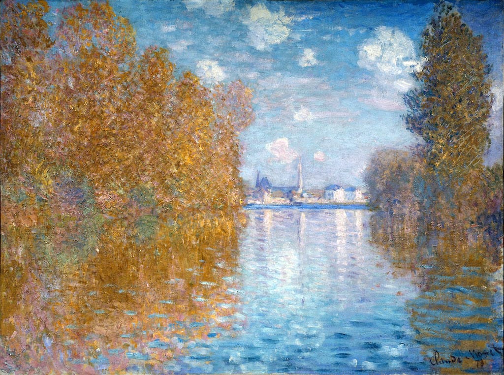
Fourth, the Impressionists tended to use what are called “complementary colours” next to one another, rather than mixing them. Complementary colours are opposite one another on a colour wheel, such as red and green, violet and yellow, and blue and orange. If two complementary colours are mixed, they produce a dull brown or gray colour. If, however, they are placed adjacent, they have the effect of intensifying one another: next to orange, blue appears brighter and more intense, and vice-versa. In his Autumn Effect at Argenteuil, Monet relies heavily on a complementary colour scheme to create the intense luminosity of a clear fall day. Like painting on a light-coloured ground, the use of complementary colours helped the Impressionists to increase the apparent brightness of their paintings.
These technical innovations made Impressionist paintings look significantly different from the traditional naturalistic representations to which the public and critics were accustomed, hence the great suspicion with which the works were greeted when they were first exhibited. Nevertheless, contemporary art critics sympathetic to the Impressionists justified the artists’ use of colour, like their rendering of space, as a more accurate representation of reality than the conventional naturalistic style that had hitherto been understood as objectively correct.
If it’s different, then it’s bad
In a salute to the realism of the new art, Theodore Duret castigated the public and critics of his day for clinging to false conventions, and praised the Impressionists for their meticulous and truthful observation of colours under specific lighting and atmospheric conditions:
The Impressionist sits on the river bank and depending on the condition of the sky, the angle of vision, the hour of the day, the calm or agitation of the atmosphere, the water takes on all colors. Unhesitatingly, he paints water with all these colors. . .the sun sets and darts its rays into the water, to fix these effects the Impressionist covers his canvas with yellow and red. Then the public starts to laugh.
Winter comes, the Impressionist paints snow. He sees that in sunlight the shadows cast on the snow are blue; unhesitatingly, he paints blue shadows. Now the public laughs harder. . . .Under the summer sun, in the reflections of green foliage, skin and clothing take on a violet hue, the Impressionist paints people under violet woods. Then the public flies into a complete rage; the critics shake their fists and call the painter “communist” and villain.
The poor Impressionist vainly protests his complete sincerity, declares that he only reproduces what he sees, that he remains faithful to nature; the public and critics condemn him. . . .For them only one thing matters: what the Impressionists put on their canvases does not correspond to what is on the canvases of previous painters. If it’s different, then it’s bad.
In this passage, Duret refers to “blue” snow and “violet” tinted flesh, which sounds ridiculous when we think of the local colour of those things. He justifies the Impressionists’ use of those seemingly inappropriate colours by asserting that the specific lighting conditions at the time transformed their appearances. It is not the Impressionists but the traditional critics and public who are at fault, for they have mistaken the conventions of past paintings for the truth of nature.
This article first appeared on Smarthistory.org.

