Exploring Impressionist Pictorial Space: Monet and Degas' Revolutionary Perspectives
Monet and Degas transformed traditional art through unconventional vantage points and spatial compositions. Their works challenged academic norms, presenting a more dynamic, lived experience of the modern world and redefining realism in art.
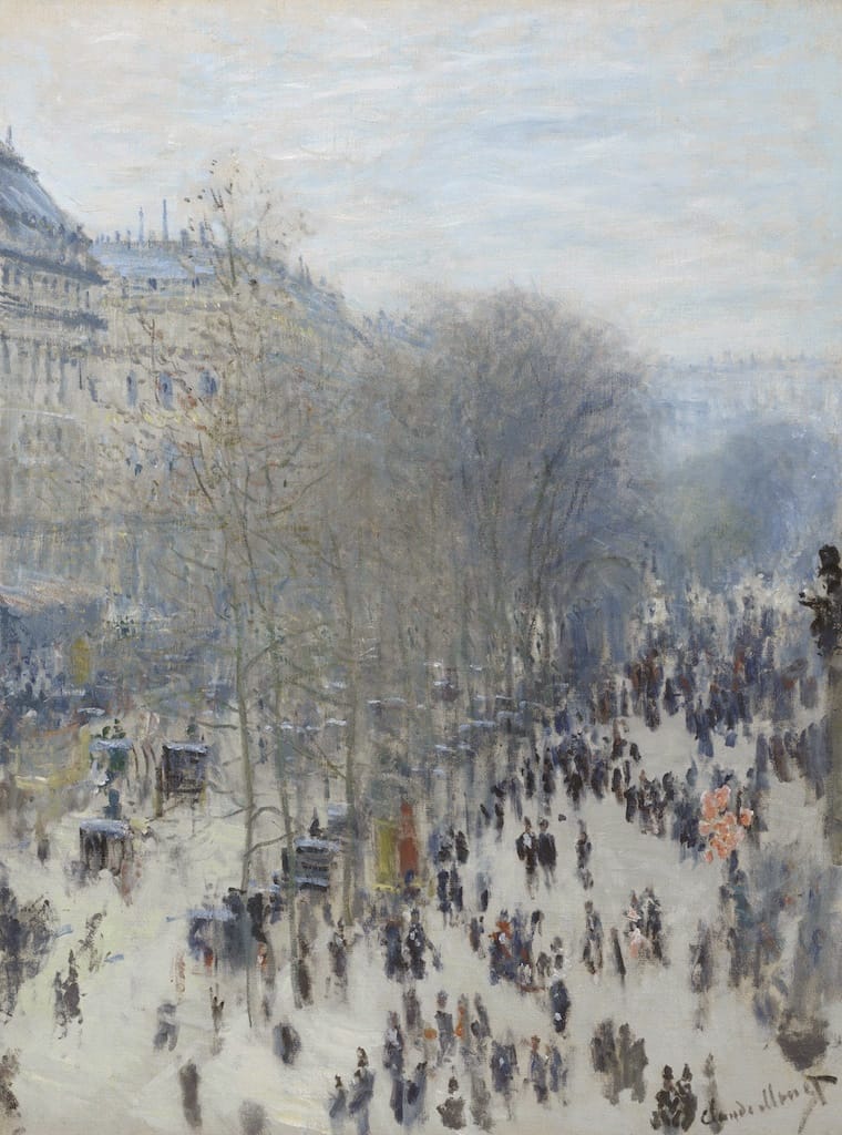
Monet’s Boulevard des Capucines depicts one of the grand boulevards of Paris. The boulevard was designed by Baron Haussmann in the mid-19th century to cut through the tightly packed medieval center of the city. The unusually high viewpoint of the painting is taken from one of the new multistory, mixed-use commercial and apartment buildings that lined these boulevards. The painting is modern in the very simple sense that its subject would not have been possible fifty years earlier.
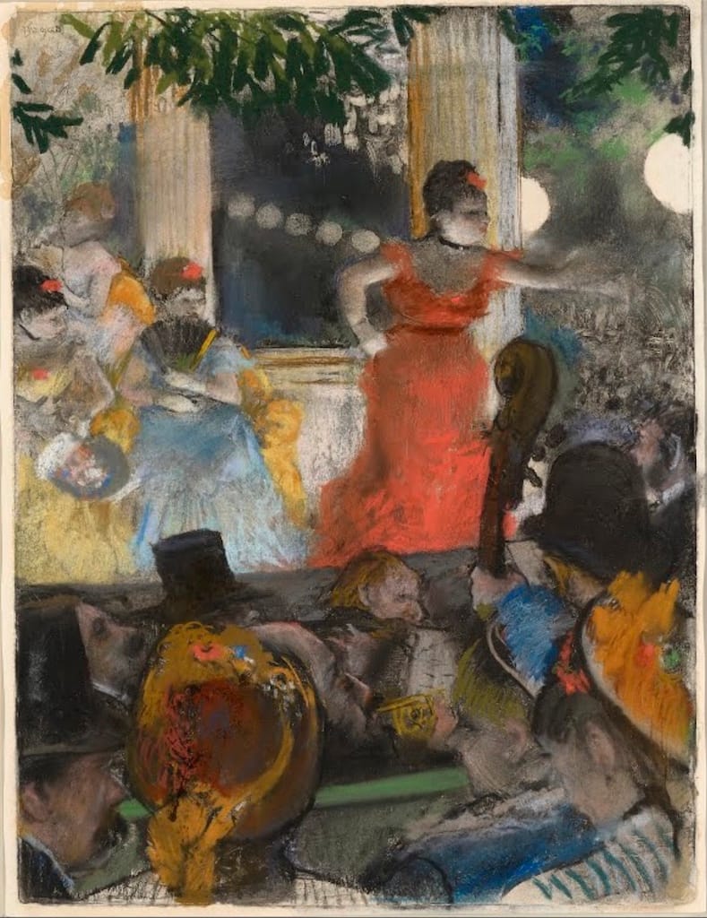
Similarly, Degas’s Café-Concert aux Ambassadeurs shows a scene in one of the new nightclubs for which Paris became famous in the late nineteenth century. Starting as occasional musical acts in what were called café-concerts, these nightclubs quickly evolved into massive cabarets, often with multiple stages, that included dance revues and acrobatics as well as large orchestras. Degas situates us in the crowded pit of one of these cabarets, looking through a forest of fancy hats and musical instruments at the performers on stage, who glow in the modern gas footlights. Both of these works typify the Impressionists’ exploration of the new spaces of Paris, as well as the new vantage points and ways of seeing that these spaces allowed.
A change in pictorial space
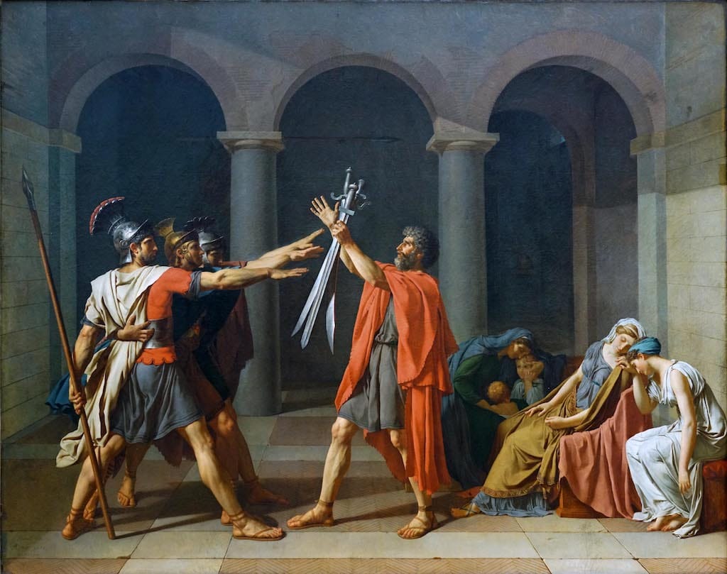
The Impressionists’ treatment of pictorial space was also often unusual. Traditional Academic artists tended to favor centered, closed, and balanced compositions such as David’s Oath of the Horatii, in which the action is carefully staged for the viewer at a measured distance back from the picture plane.
Although we can infer our viewpoint in Monet’s Boulevard des Capucines, it is unusual in that the artist gives us no clear place to stand in the work, and the orthogonal lines of the boulevard sweep off the right-hand side of the canvas, as though we were leaning perilously out a window or over a balcony railing. Similarly, Degas’s Le Café-Concert aux Ambassadeurs is remarkable for its failure to use any perspectival techniques to create space for its thicket of bodies, which emphasizes the sense of being jostled in the middle of a crowd.
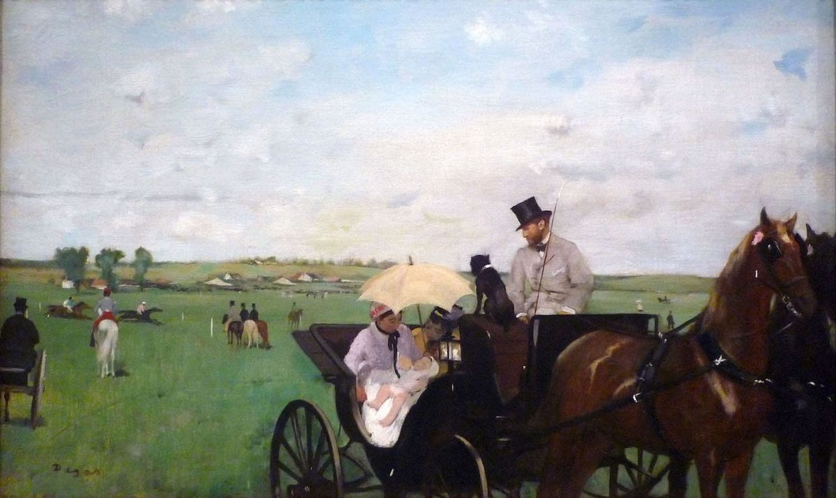
Even more unusual is Degas’s treatment of pictorial space in his painting At the Races in the Countryside, a scene set at one of the racetracks situated on the outskirts of Paris. The main focus of the work is obvious: the wet nurse and child, who are framed by the carriage door below and by a yellow parasol above, and who are the focus of attention of the child’s mother, the driver of the carriage (Paul Valpinçon, the child’s father), and their dog. This focal point is placed at the exact horizontal center of the canvas, as we might expect, but Degas appears to have achieved this placement at considerable cost to the rest of the composition. The work is egregiously unbalanced, the right hand side being crowded with heavy, dark shapes and the left hand side relatively light and empty. Furthermore, one of the horses is cropped awkwardly at the nose; the legs of both horses and the wheels of the carriage are abruptly truncated; and the carriage on the left, which is already leaning perilously to the right, has had its left supporting wheel cut off by the edge of the canvas. The work has the appearance of an amateur photographic snapshot, where subjects are frequently centered but little attention is paid to what is happening at the edges of the composition.
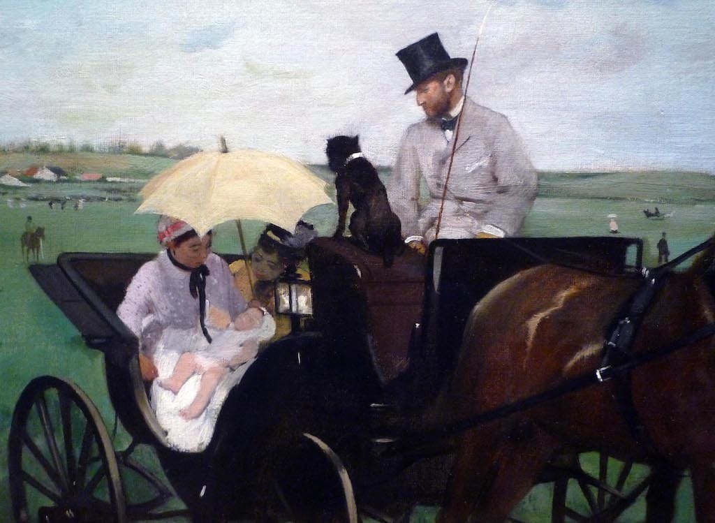
Unlike a photograph, however, a painting cannot be executed in a fraction of a second, and it would have been remarkably careless if Degas had trapped himself into this unbalanced composition and these odd truncations of the figures by beginning his work in the wrong place or at the wrong scale—or if, when he saw what was happening, he did not correct it. We must conclude that Degas actively sought the effects of imbalance and seemingly arbitrary cropping, no matter how unusual or awkward they may seem. Why? In a review of the second exhibition of the Société anonyme (1876), the critic Edmond Duranty justified these and similar violations of conventional pictorial space and carefully organized compositions by asserting their greater truth to lived visual experience:
People and things have a thousand ways of being unexpected in reality. Our point of view is not always in the middle of a room with two side walls receding toward the back wall; it does not always arrange the lines and angles of cornices with mathematical symmetry. . . .[One’s viewpoint] is sometimes very high, sometimes very low, sometimes it misses the ceiling, views objects from their undersides, unexpectedly cuts off the furniture. . . .
A man in a room or on a street is not always standing in a straight line at an equal distance from two parallel objects; he is likely to be situated on one side of the space. He is never in the center of the canvas or in the center of the setting. He is not always shown as a whole; sometimes he appears cut off at mid-leg, or half-length, or sliced longitudinally. Sometimes, one sees him very close-up, at full size, while very tiny, far back in the the distance appears a crowd in the street or groups assembled in a public place.
Old systems fall apart and new ones take their place
Notice that Duranty justified the radical spatial and compositional effects of Impressionism by describing the new artists’ paintings as more accurate than the established conventions of academic painting. Our views as we move through the world are not always centered and balanced; nor does space always recede with the mathematical regularity typical of traditional academic paintings. The systematic perspectival techniques that had dominated Western art since the Italian Renaissance, and which had been formulated to help make paintings look more true to life, are revealed to be mere artifices. The type of argument Duranty employed becomes a commonplace not only of Impressionism but of other movements as well: surprising new pictorial effects, which at first sight appear to be errors, are justified as being more accurate than the established conventions of past art. In this way modern art can sometimes remind us that what we think of as “realistic” or “natural” really only describes the social and artistic conventions to which we are so habituated that we accept them without question.
This article first appeared on Smarthistory.org.


