Beginner’s Guide to Understanding Colour Theory in Painting
Understanding colour theory helps painters make confident artistic decisions. From the colour wheel and complementary contrasts to value and saturation, these fundamental principles guide artists in mixing colours, creating harmony, and bringing greater depth and clarity to their paintings.


Colour is one of the most powerful elements in painting. It shapes mood, guides the viewer’s eye, and gives structure to a composition. Even the simplest painting can become expressive and visually compelling through thoughtful use of colour. For beginners, however, colour can also feel overwhelming. The sheer number of available pigments and the complexity of mixing them may appear confusing at first.
Colour theory offers a framework that helps artists understand how colours relate to one another and how they can be used effectively in painting. While experienced painters often rely on intuition built over years of practice, the principles of colour theory provide an essential foundation for anyone beginning their journey in art.
The Colour Wheel
The most useful starting point for understanding colour is the colour wheel. This circular diagram organises colours in a way that visually explains their relationships.
The colour wheel traditionally begins with three primary colours: red, blue, and yellow. These colours cannot be created by mixing other pigments. Instead, they serve as the building blocks from which other colours are derived.
When two primary colours are mixed, they produce secondary colours. Red and yellow create orange, yellow and blue produce green, and blue and red form purple.
Further mixing leads to tertiary colours, which lie between primary and secondary colours on the wheel. Examples include red-orange, blue-green, and yellow-green. These colours often appear more subtle and complex than the primary and secondary hues.
For painters, the colour wheel functions almost like a visual map. It helps artists predict the results of mixing pigments and understand how colours interact within a composition.
Warm and Cool Colours
Another important concept in colour theory is the distinction between warm and cool colours.
Warm colours include reds, oranges, and yellows. These colours are often associated with sunlight, fire, and warmth. In painting, warm colours tend to advance towards the viewer, making objects appear closer and more immediate.
Cool colours include blues, greens, and purples. They evoke associations with water, shade, and calm environments. Cool colours generally appear to recede in space, which can create a sense of distance or depth within a painting.
Understanding this relationship allows painters to control spatial perception. For example, warm colours can be used in the foreground of a landscape, while cooler tones can suggest distant hills or sky.
Artists rarely work with pure warm or cool colours alone. Instead, most pigments contain subtle shifts. A blue with a hint of green may feel cooler, while a blue leaning slightly towards purple may appear warmer.
Hue, Value, and Saturation
When discussing colour in painting, three key characteristics are frequently used: hue, value, and saturation.
Hue refers to the basic identity of a colour, such as red, green, or blue. It is what most people mean when they refer simply to “colour”.
Value describes how light or dark a colour is. Even without changing the hue itself, a painter can adjust value by adding white, black, or another pigment. In many cases, value is more important than hue in determining how convincing a painting appears.
For example, a portrait painted entirely in shades of grey can still appear realistic if the values are correct.
Saturation refers to the intensity or purity of a colour. Highly saturated colours appear vivid and bright. Colours with low saturation appear muted, soft, or subdued.
In practice, painters often reduce saturation to achieve more natural effects. Pure colours straight from the tube can appear too intense for many subjects. Mixing colours with their complements or with neutral tones can create more subtle variations.
Complementary Colours
One of the most useful relationships on the colour wheel is the concept of complementary colours.
Complementary colours are pairs located opposite each other on the colour wheel. Examples include red and green, blue and orange, and yellow and purple.
When placed next to each other, complementary colours create strong visual contrast. Each colour appears more vibrant because the eye perceives the difference between them.
This principle has been used by painters for centuries. For instance, an artist might place a small area of orange within a predominantly blue composition to draw the viewer’s attention.
Complementary colours also play an important role in colour mixing. When mixed together, they tend to neutralise each other, producing browns or greys. This technique allows painters to reduce the intensity of colours without simply adding black.
Colour Harmony
While contrast can create visual excitement, paintings also benefit from colour harmony. Harmony refers to combinations of colours that feel balanced and pleasing to the eye.
Several common approaches help painters achieve harmony.
Analogous colour schemes use colours that sit next to each other on the colour wheel. For example, a painting might feature blues, blue-greens, and greens. Because these colours share similar components, they tend to blend naturally and create a calm visual effect.
Triadic colour schemes use three colours spaced evenly around the wheel, such as red, yellow, and blue. This approach produces a balanced yet lively palette.
Monochromatic colour schemes rely on variations of a single hue. A painting might consist entirely of blues, ranging from pale tints to deep shadows. Although limited in hue, such compositions can still be rich and expressive through changes in value and saturation.
Understanding these structures allows artists to design colour relationships intentionally rather than relying entirely on chance.
The Role of Neutrals
Many beginners focus primarily on bright colours, yet neutral tones play an equally important role in painting.
Neutrals include greys, browns, and muted colours that sit somewhere between the primary hues. They often appear less dramatic, but they help create balance within a composition.
Without neutrals, a painting filled with highly saturated colours can feel overwhelming. Subdued tones allow the brighter colours to stand out more effectively.
Neutrals can be created in several ways. One method involves mixing complementary colours. Another approach is to combine all three primary colours in varying proportions. Many painters also mix colours with small amounts of earth pigments such as burnt sienna or raw umber to achieve natural-looking tones.
In landscape painting, for example, the greens of foliage are rarely pure. They often contain hints of red, brown, or yellow that make them appear more believable.
Light and Colour in Painting
Colour cannot be separated from light. The appearance of any colour depends on the lighting conditions in which it is seen.
Outdoor painters quickly notice that colours change throughout the day. Morning light often appears cool and soft, while afternoon light can be warmer and more intense. During sunset, the entire landscape may shift towards oranges and reds.
Artists use colour to suggest these changing conditions. Shadows may contain cooler tones, while areas struck by direct sunlight may appear warmer and brighter.
Understanding how light influences colour also helps painters create atmosphere. A misty scene may involve muted colours and low contrast, while a clear midday landscape may feature stronger contrasts and brighter hues.
Practical Colour Mixing
For beginners, the best way to understand colour theory is through practice. Mixing colours on a palette reveals subtleties that cannot always be predicted by theory alone.
A useful exercise is to create a colour mixing chart. By systematically mixing each primary colour with the others, painters can see the range of possible results. Recording these mixtures helps develop familiarity with specific pigments.
Another helpful practice involves limiting the palette. Many painters begin with only a few colours, such as a warm and cool version of each primary. This restriction encourages careful observation and thoughtful mixing.
Over time, artists begin to recognise patterns. They learn which combinations produce vibrant colours and which mixtures lead to dull or muddy results.
Developing an Eye for Colour
Although colour theory provides helpful guidelines, painting ultimately involves observation and personal interpretation.
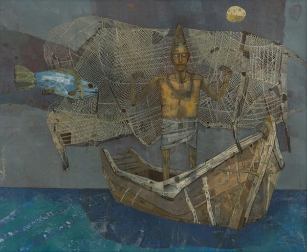
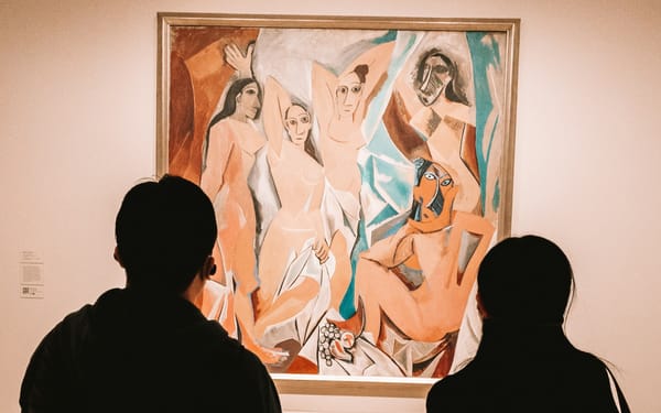
Many painters train their eye by studying artworks in museums or galleries. Observing how different artists handle colour can reveal a wide range of approaches. Some painters favour subtle, muted palettes, while others embrace bold contrasts and vivid hues.
Nature itself is perhaps the greatest teacher. By carefully observing the colours in everyday surroundings, painters begin to notice relationships that might otherwise go unnoticed. The greens of a forest, for example, may contain hints of yellow, blue, or even purple depending on the lighting.
With practice, colour decisions become more intuitive. What initially requires deliberate thought gradually becomes part of the artist’s instinctive process.